Design Details
Design details are not the most important part of the product experience, but as mass of detailed problems accumulated, the users' impression got generated, thus influence the reputation of the product. Such as whether to retain the mobile phone number entered by the user when the Password login mode and SMS Verification Code login mode are switched.
If tons of interaction details are done well, users may not even notice a thing. However, if some of them are not properly designed, users will get a feeling like "stumbling".
Project 1.
Slider Input for Material Params
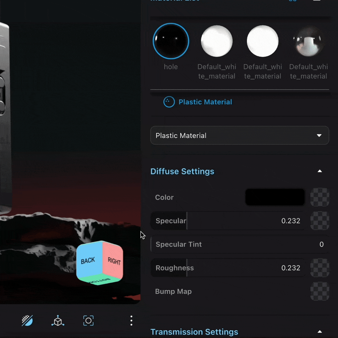


The Material Editor has hundreds of parameter sliders, each with its own range, step size, and minimum granularity. We made many detailed design decisions for the input:
- The input has both manual input and dragging slider options to accommodate different user habits and usage scenarios.
- Adaptive parameter range: dynamically adjusts the maximum and minimum values of the slider based on the user-set parameter values in real time.
- Allows users to input decimal values with up to six decimal places, but only displays three decimal places when dragging the slider, so as not to "suddenly appear a long string of numbers."
- Holding down Shift and Ctrl/Cmd increases/decreases the step size of the parameter adjustment.
- Pressing the up and down arrow keys does not work. Many component libraries support using the keyboard up and down keys to quickly increase/decrease by +1/-1, but since the parameter sliders in the Stone Point parameter panel are arranged vertically, pressing the up and down keys also gives the impression of moving the active position up and down, so we did not adopt this function.